Abduzeedo is a blog I usually visit to find inspirational design.
Other Logo Design Websites I have found thanks to this site are below.
One of the fundamental things about logo design is focus on colour schemes. You should have 2-3 colours for an effective logo, although there are some successful brands with 4 colours in their logo's.
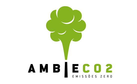
Here are some interesting logos.


Its everywhere (Helvetica) 0_0


-Peter Vasvari

-Prasad Bhat

-Shawn Huff

-Nickolas Skuza


I really like the style of this one, the designer takes into account the number of tiles on the board itself and makes them into stars. I respect little details like this in designs. I must keep this in the back of my mind if I want the Popular Peace logo to be, well, popular I guess.


-Mateusz Turbinski

-Wladimir Yeberz

"Krikaskól is an integrated pre-and primary school for children aged 1 to 9 years. The idea behind the logo is to represent the merger of these two educational levels. The image shows two children playing, intertwined as one. They also form a tree symbolizing growth and maturity. The nine circles forming the head of the children and the tree leaf represent the nine years that school lasts. The circles are also a reference to circular forms that is a theme in the schoolbuilding itself. The motiv of the building is a tree. The colors symbolize nature and learning from life, learning by doing. The trunk of the tree forms the letter "K"."
-Stefan Einarsson

-Zygat3r zygat3r.deviantart.com

This logo give me shivers; must be good then right?
-Luke Despatie

-Studio 7 Designs www.studio7designs.com

-Dalius Stuoka

-Mel Campbell

-Brandberry www.brand-berry.ru

Maybe its just me but I would call this an optical illusion.
-Nido www.thisisnido.com

-Aaron Rudd www.aaronrudd.co.uk

-Nowonly www.incspring.com/users/nowonly

-Reghardt Grobbelaar www.cakesama.com

-Mike Erickson www.logomotive.net

-Bartodell www.bartodell.com

-Andre Weier www.nalindesign.com

-Benjamin Mandzyuk www.creamycss.com


-Denis Wong www.entzcreative.com

"A company in Barnaul which produces instant food products in portion packages specialized in production of cooked cereals – buckwheat, pea and oat flakes. The company’s competitors produce noodles. Therefore a formalized image of a spoon (in contradiction to fork used to eat noodles) was used. Laconic grapheme was developed from a very simple composition of a spoon lying on a plate and resembling letter “Q”."
-Alexey Shelepov

"Architects Revolver is a logo for the italian web forum architectsrevolver.com about architecture. New technologies, suggestions and comments about new trends and architectural designs can be found in this blog. The slogan is: Give it a "Shot" - suggesting by this way all young architects to participate and leave a comment!"
-Kosmas Apatangelos

"OIKOS Ecological Solutions is a Mumbai based company that is dedicated to making the world a greener, healthier place to live in, for the benefit of not only human-kind, but the animal kingdom too. The aim is to study and understand how natural systems function, and implement it efficiently into human processes and systems. Frogs are one of the best natural ecological indicators, as a diverse frog population in an area is indicative of a robust ecological system. Frogs, being amphibians (can live on land or in water), can record even minute ecological shifts on their sensitive, permeable skins. This was one of the reasons we chose to have a frog represented in the OIKOS logo design. The second reason was the client’s deep personal affection towards the amphibian!"
-Gayle D'souza, Karlyle Gomes

I enjoy subtlety in logos. It makes it all the more sleek too look at on letterheads and the like
-Cris Labno www.crislabno.com

"NF is a social care organisation, helping predominantly fathers whose children's relationship with them is under threat, usually following separation or divorce. They offer information, advice and support services on how to do the best for their children and are the only organisation that provides these services on a national basis."
Provoking an emotional response...noted. Its well known that the majority of multimedia outlets tend to try and pull on heartstrings; its almost seems guilty to do it. If done well though, it can be forgiven in my books.
-Phil Armstrong

"Tennis XL is an agency that encourages exposure to the values of sportsmanship, competition and play through the game of tennis. It delivers tennis programs to youth during and after school. It needed to update its image to appeal to youth, parents and schools and most importantly to clearly express the nature of its activities. The mark we devised emphasizes the fun and dynamic aspect of the game without neglecting the importance of the human interaction it facilitates. The merging of the racket and jumping figure offers immediate recognition of the agency's activities."
-Isabelle Swiderski

-Mika design http://mika-design.ru

-Ivan B2F www.b2f.lv/

-John Mascarenhas brandstack.com/users/profile/LogoGuppy
Well played.
-Daniel Smyl www.danielsmyl.pl

-Mike Erickson www.logomotive.net

-Milou www.behance.net/milou/frame

-Narendra Keshkar www.coroflot.com/captonjohn
-Denis Ignatov hyperian.narod.ru

-Chad Sanderson www.behance.net/ChadSanderson

-Alex Tass www.nocturn.ro
No comments:
Post a Comment